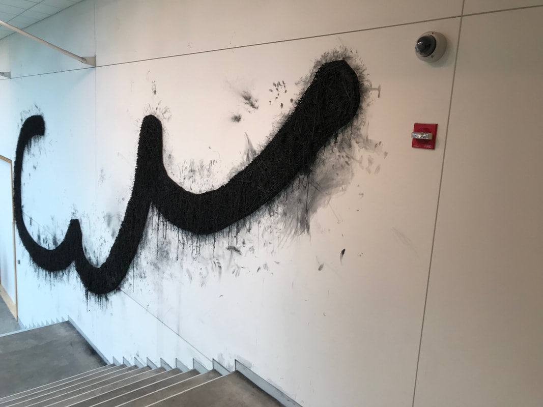
The wall-sized mural/drawing depicts the word “plunder” in giant, curving strokes of Gregg shorthand, the stenographers’ tool that translates sounds into curving and bisecting lines. It is an abstract image for the many people who cannot read shorthand, yet is also a precise rendering of the word, “Plunder.” Lewis's work of art, called "Plunder" continues his ongoing investigations of the relationships between drawing, abstraction, and language. In a number of his previous artworks, he would feature sayings (in English lettering) from the book, "Life's Little Instruction Book."
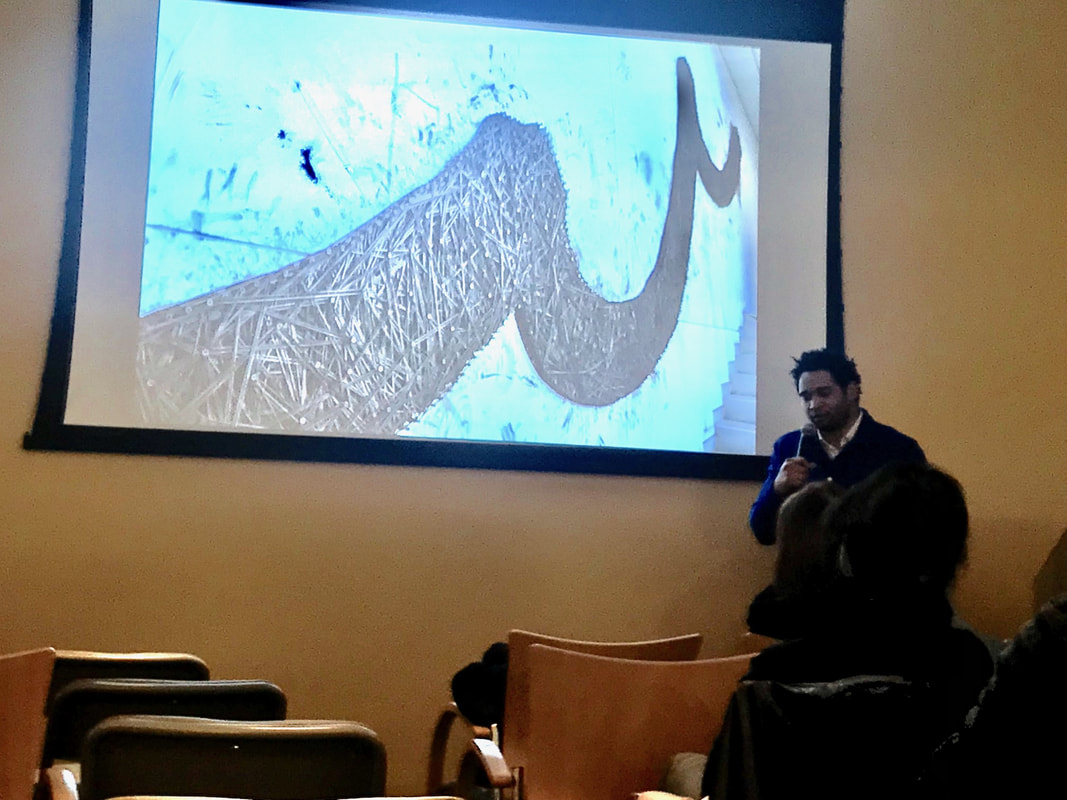
If you take a close-up look at the wall drawing, you'll see his use of screws and graphite-dipped rubber bands to generate the large line drawing. There are 19,000 rubber bands, each dipped in graphite, the same mark-making material found in pencils, and each fastened by screws drilled into the wall. Lewis created “Plunder” over five days in October with the help of nine Brandeis undergraduate students. It's on view at the Rose Art Museum through June 10, 2018. for more information, please visit: www.brandeis.edu/rose
0 Comments
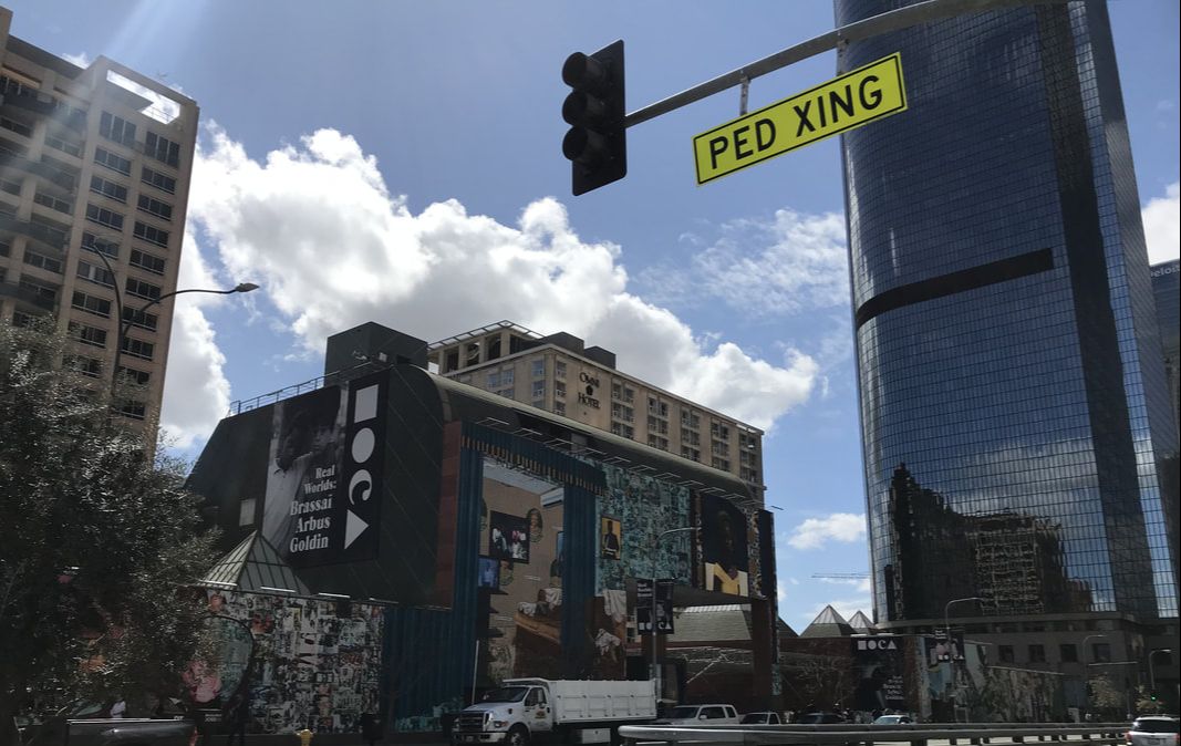
The Museum of Contemporary Art is actually comprised of three locations. The first is the MOCA Pacific Design Center in West Hollywood; the second is the MOCA on Grand Avenue; and the newest location is the Geffen Contemporary. There is actually a fourth location in Nevada. Yes! Nevada. The artist, Michael Heizer's artwork titled, "Double Negative" is a work of land art located in the Moapa Valley on Mormon Mesa near Overton, Nevada and was acquired into MOCA's permanent collection in 1985. If the artist's name rings a bell, it's because I recently wrote about his other monumental piece of artwork at the Los Angeles County Museum of Art; CLICK HERE TO READ THE BLOG ARTICLE. I should note that time didn't permit me to visit the Pacific Design Center, or the Geffen Contemporary (or visit Nevada), so this post will only include my visit to the MOCA on Grand Avenue. I also visited the Broad Museum (Read On & See Below.) The Geffen Contemporary is just a 15-20 minute walk from MOCA Grand and admission to one museum grants you admission to the other museum.
The MOCA on Grand Avenue housed an entire gallery room with Mark Rothko paintings. While I can appreciate Rothko's artwork and acknowledge its importance in art history, his paintings are not my favorite. I do love all the colors, and I also love the shapes, however, there is ambiguity, blurring of lines, that doesn't hit me the right way. Rothko wanted viewers to stand close to his paintings to see the vertically stacked bands of color seem to float upon colored grounds.
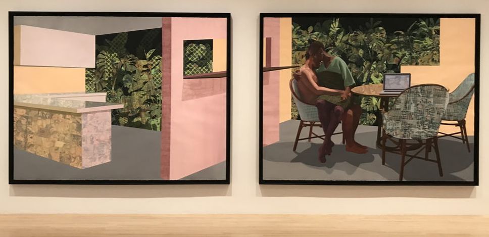
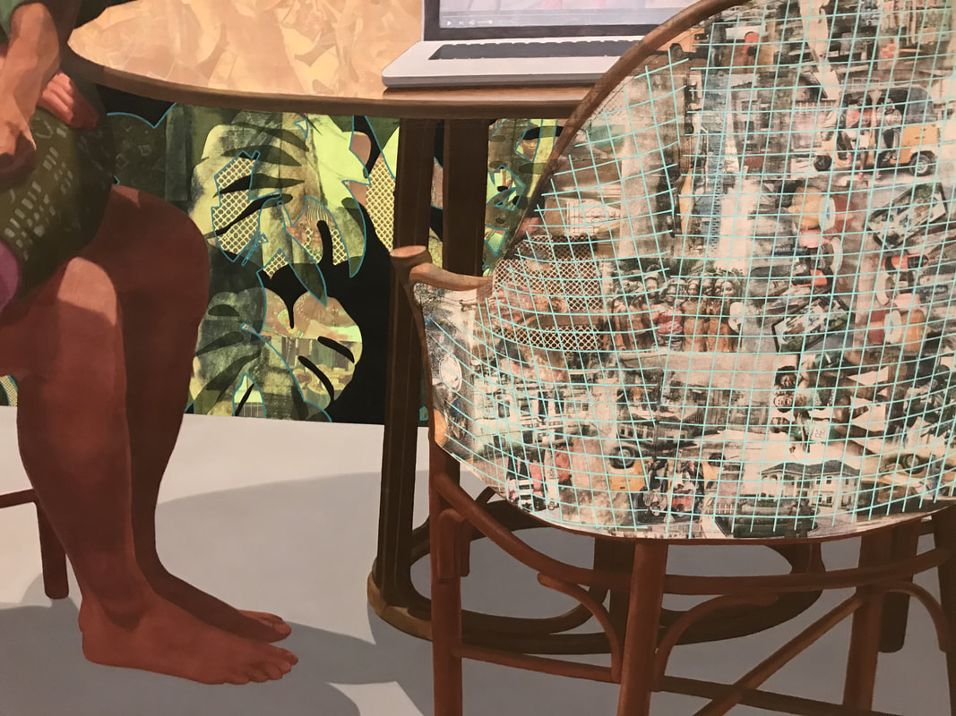
This large painting on two panels is by the artist, Njideka Akunyili Crosby. It's called "Garden, Thriving" and was completed in 2016. Her artwork was quite fascinating to see in person and I've included a detailed photograph of the two-panel painting. Originally from Nigeria, the artist layers photographic imagery within the chairs' fabric and the plant leaves. The images are pictures of Nigerian pop stars, models, military dictators, celebrities, and the artist's own personal photographs. To create this artwork, she uses acrylic paint, transfers, colored pencils, and collage on paper. There is so much to see in this painting, you could look at it for 10-20 minutes, or longer! I should also mention that the mural that is wrapped around the exterior of the museum is by this same artist!
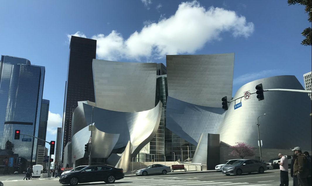
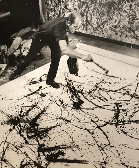
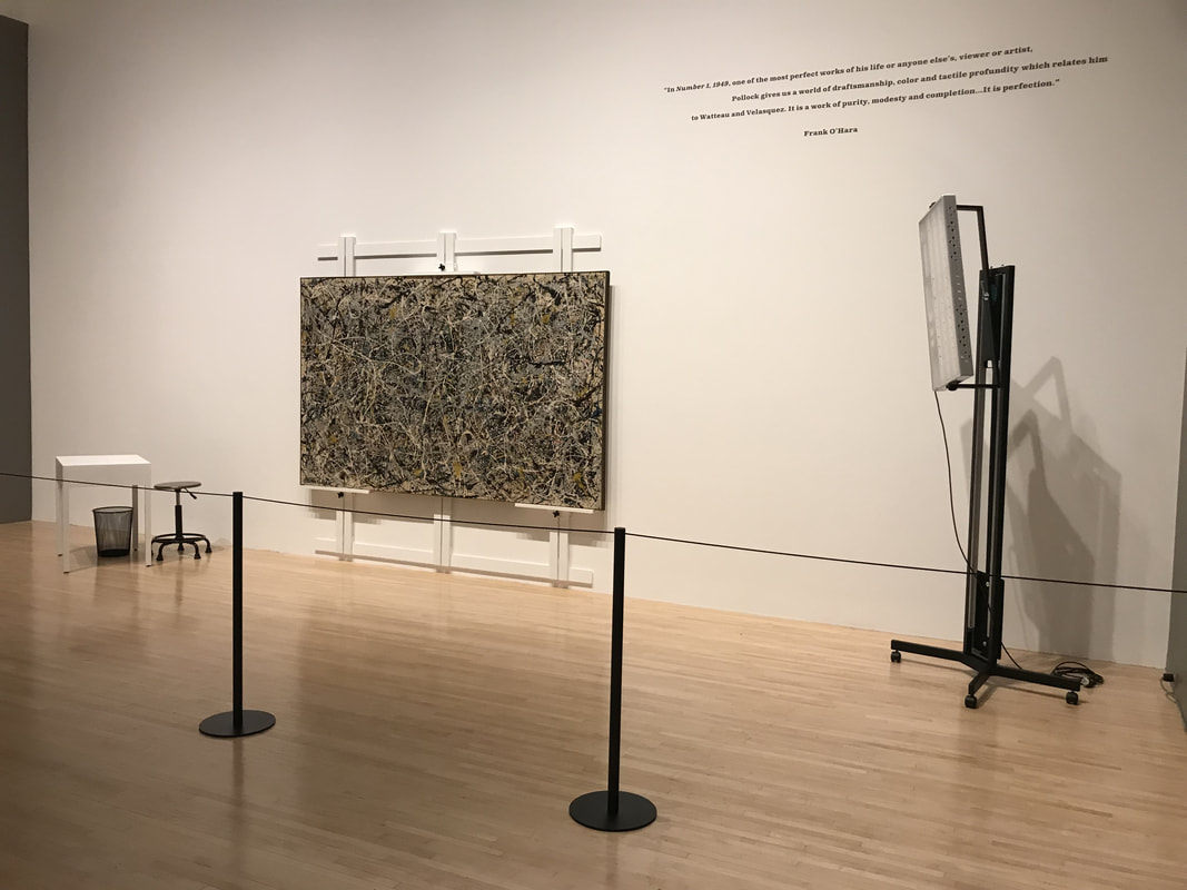
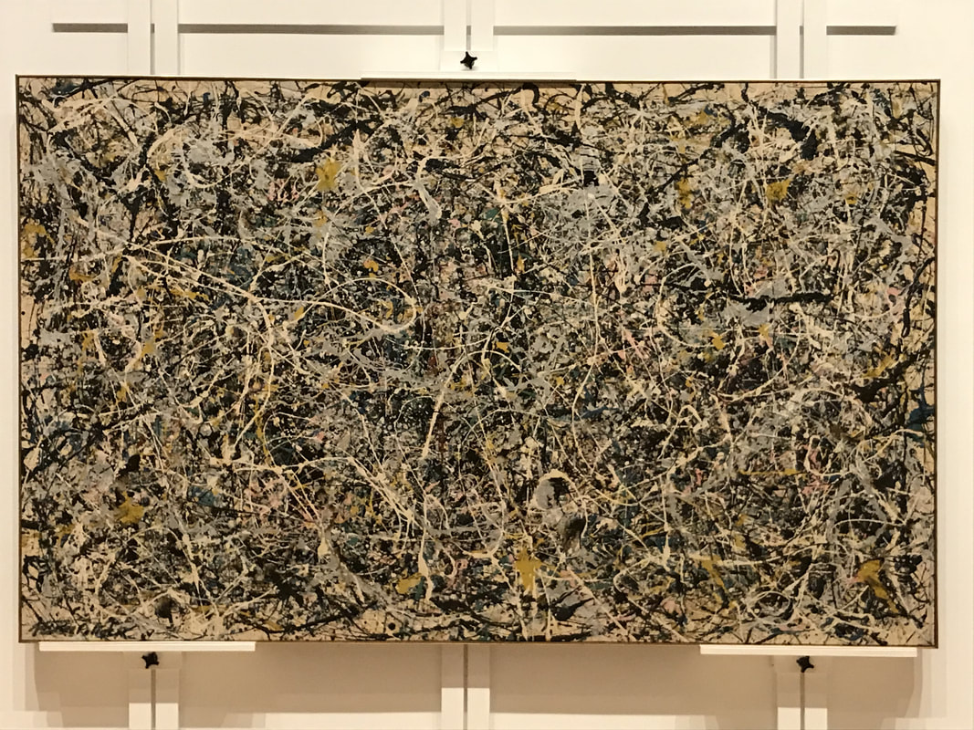
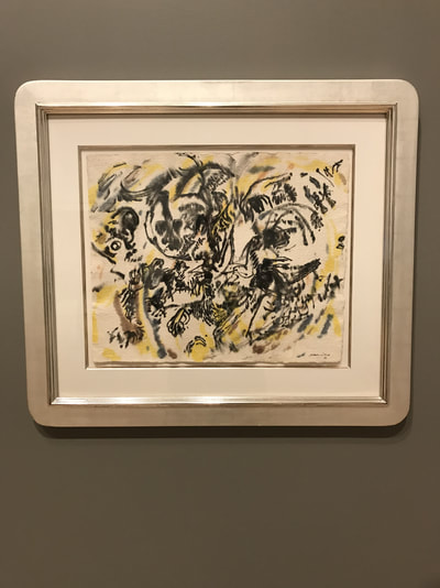
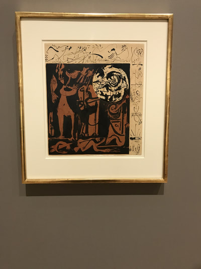
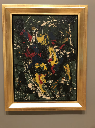
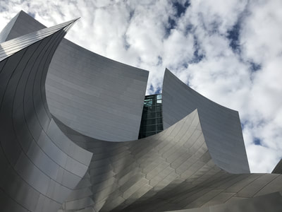
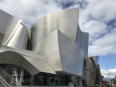
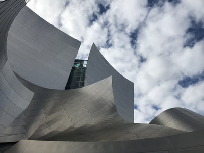
Three other works by Jackson Pollock from MOCA’s permanent collection, were also on view. These were great examples of the diversity and range of materials Pollock used in his artwork from watercolor to collage. Walt Disney Concert Hall, Los Angeles, California This building is simply spectacular. Frank Ghery is one of my favorite architects and this is a perfect example of why that's the case. (In addition to all the awards he has won for his incredible architectural design). Frank Gehry was asked to devise a new home for the Los Angeles Philharmonic and the Walt Disney Concert Hall opened in 2003. Reflecting Gehry’s longtime passion for sailing, the structure’s exterior features are expanses of stainless steel that hover above Grand Avenue. Frank Gehry has devoted his career to disrupt the very meaning of design within architecture. From the iconic Guggenheim Museum Bilbao to the Fondation Louis Vuitton in Paris, and now the Walt Disney Concert Hall in Los Angeles, Frank Gehry has proven time and again the beautiful magic of his whimsical, cutting-edge design.
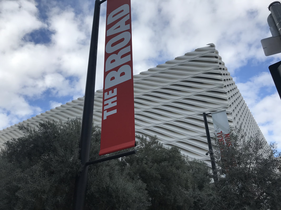
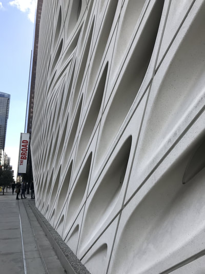
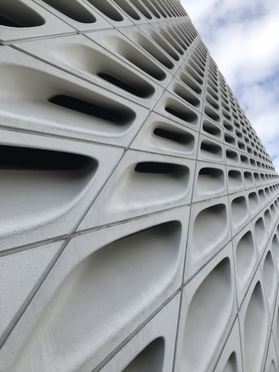
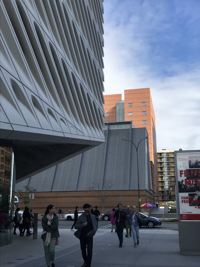
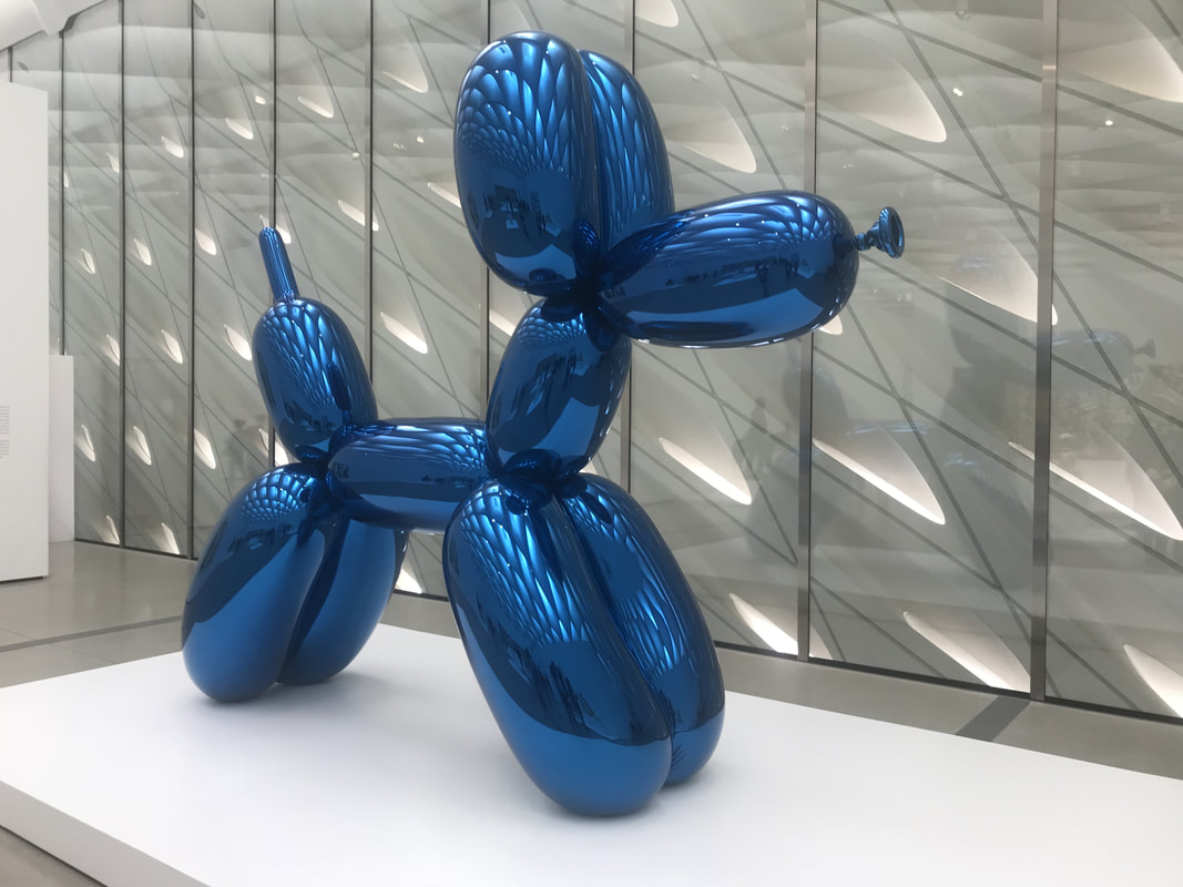
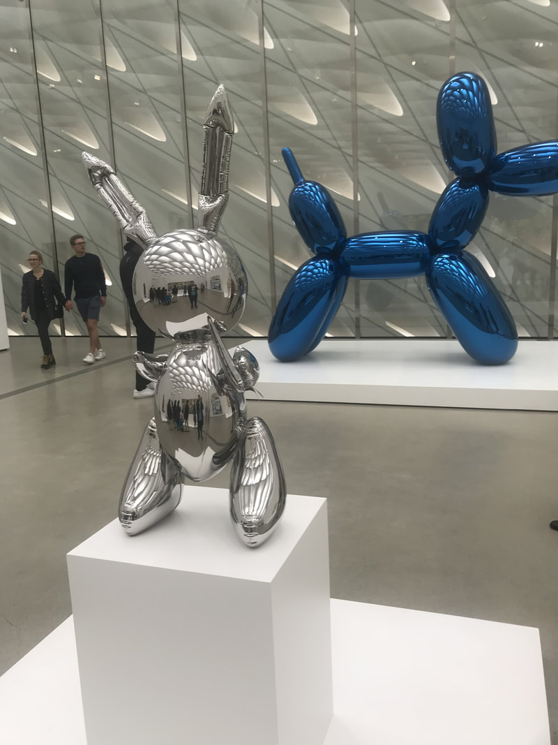
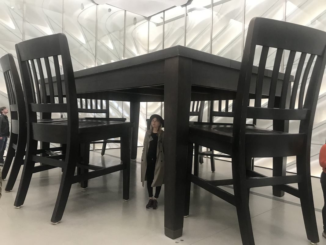
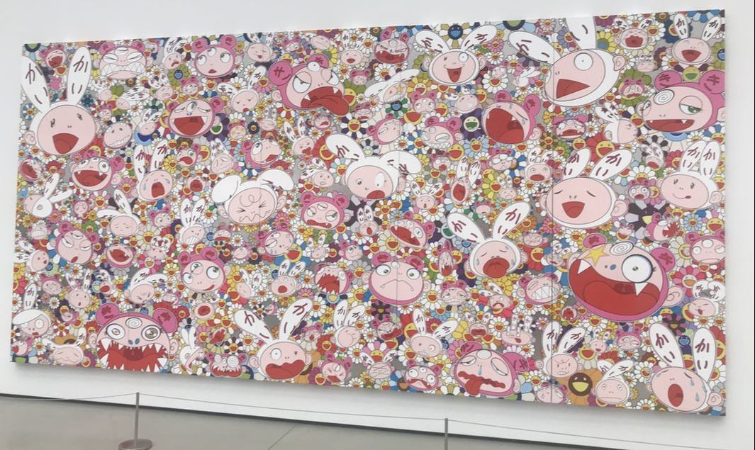
The Broad is one of the finest contemporary art museums I have ever visited. Founded by philanthropists Eli and Edythe Broad, the museum houses more than 2,000 works of art and holds one of the most prominent collections of postwar and contemporary art worldwide. The Broad's third floor galleries show a rotating selection of artwork and, best of all, it is free! The first floor galleries are for special exhibitions, like the Jasper Johns exhibit "Something Resembling Truth" that runs through May 13, 2018. So let's talk about the beautifully designed building... It's often called "The Veil and the Vault" because the building has gallery space as well as an extensive storage facility. In contrast with the neighboring Walt Disney Concert Hall, The Broad was designed to be porous and absorptive. There are wonderful olive trees that were planted in the plaza next to the museum. There were a number of artworks by Jeff Koons at The Broad. "Balloon Dog (Blue)" is perhaps one of his series of works that is most famous. The artwork is made of stainless steel and wights 2,000 pounds. It was created as part of his Celebration Series, a group of paintings and sculptures that memorialize rituals, icons, and images related to birthdays, holidays, and other celebratory parties or occasions.
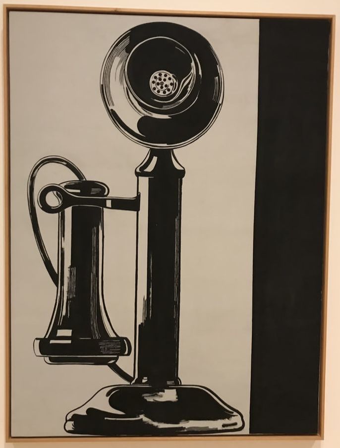
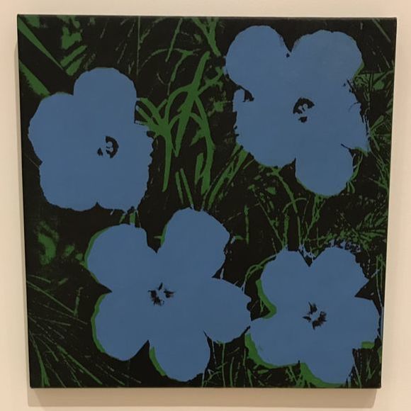
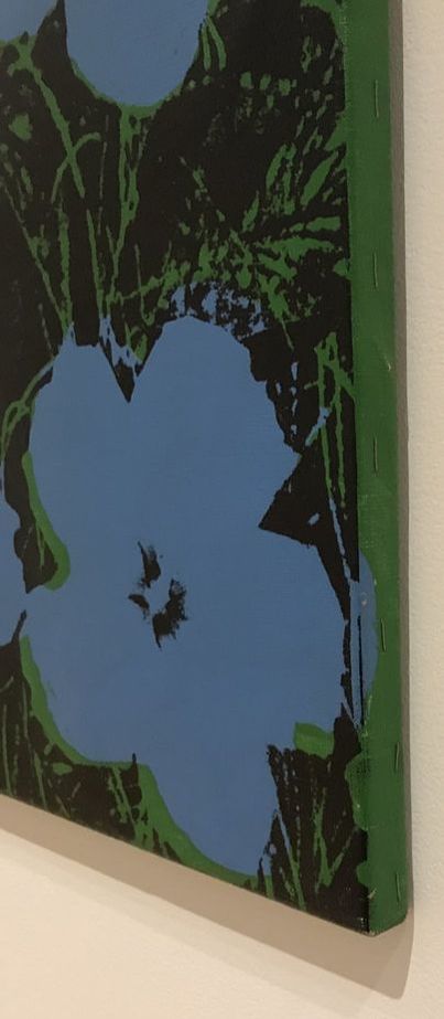
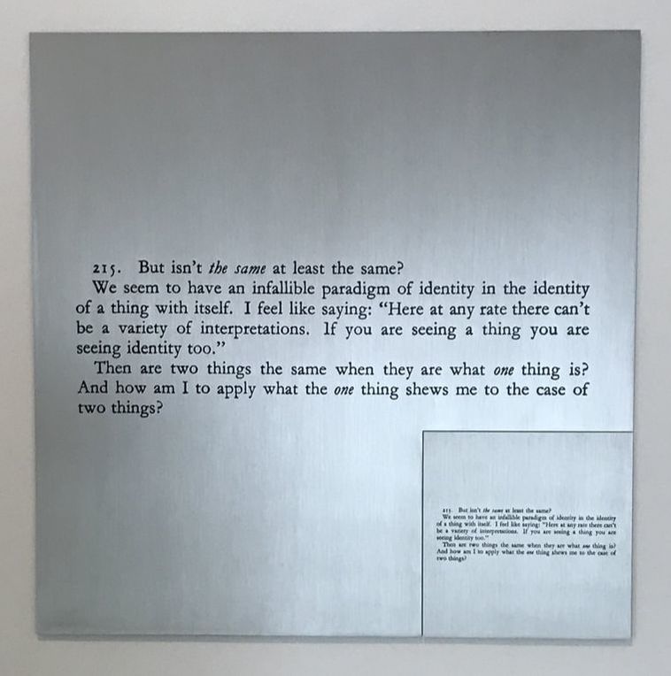
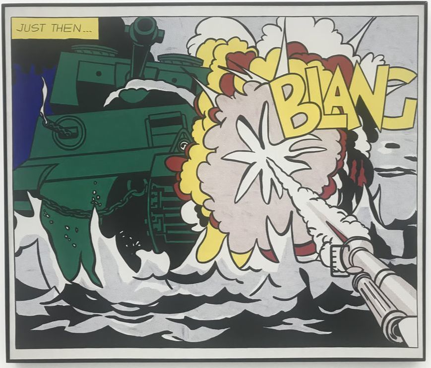
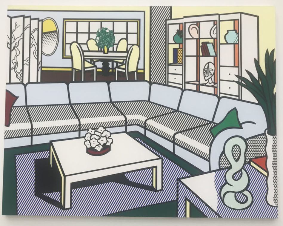
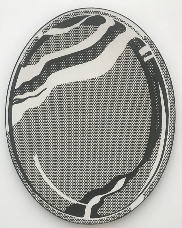
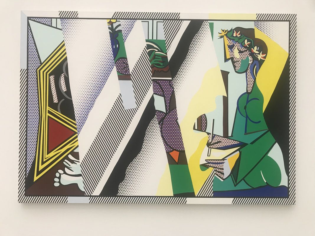
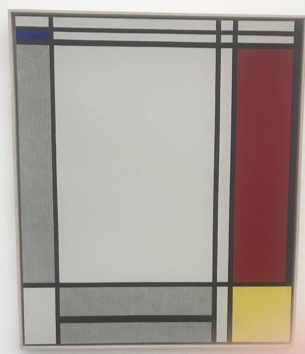
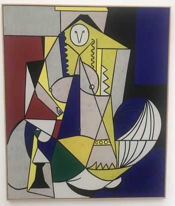
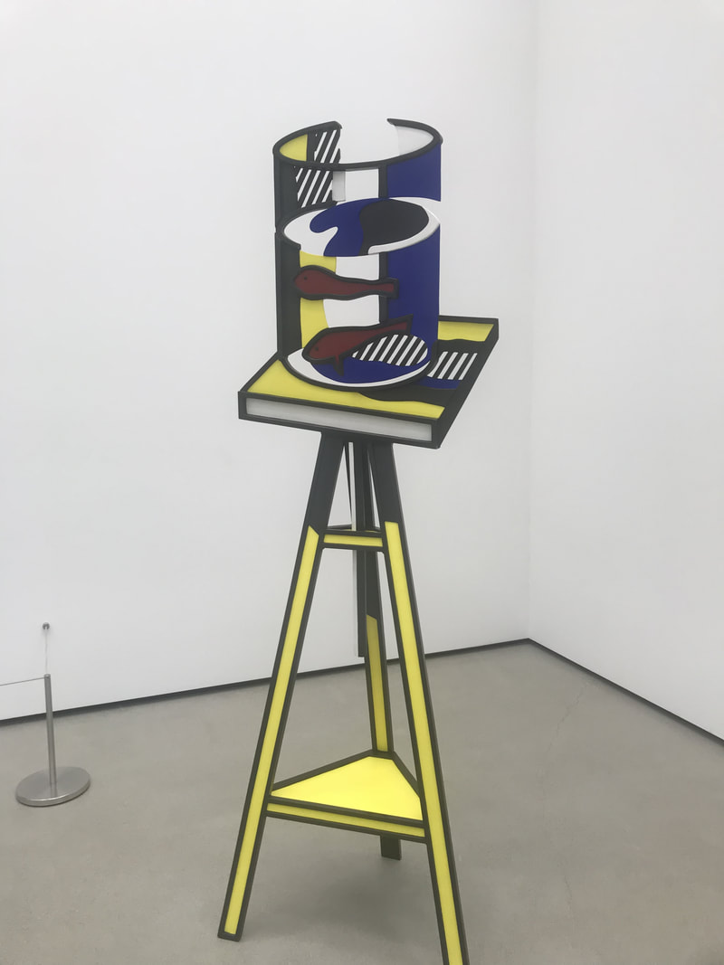
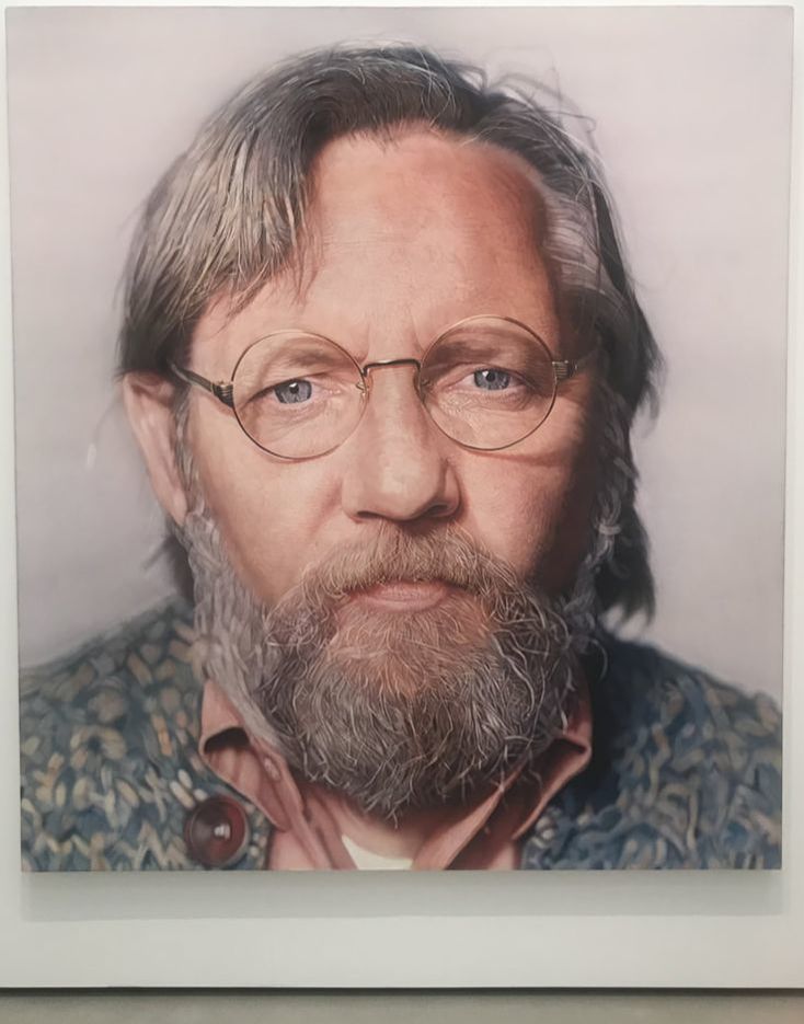
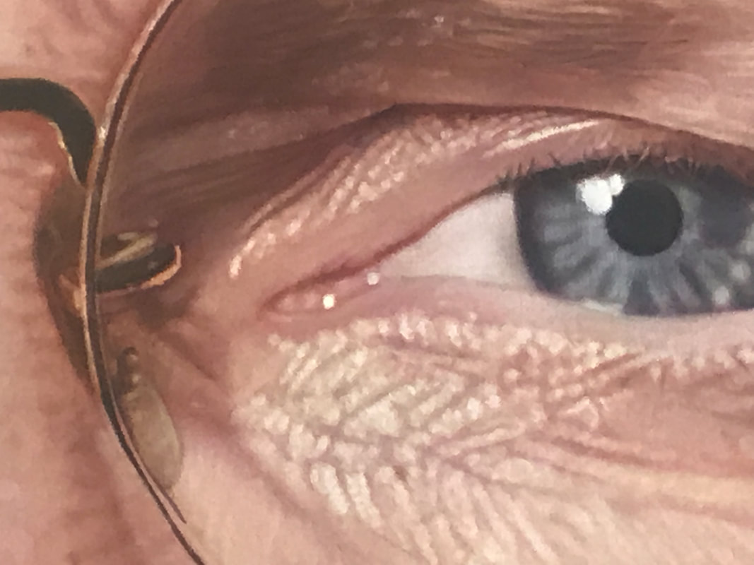
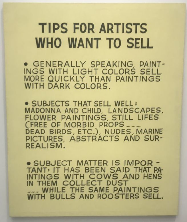
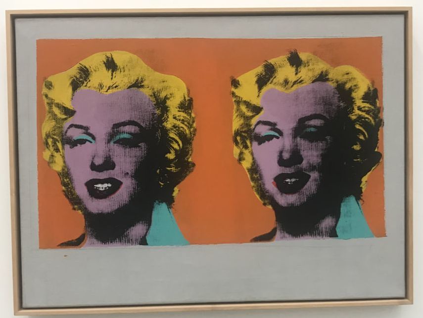
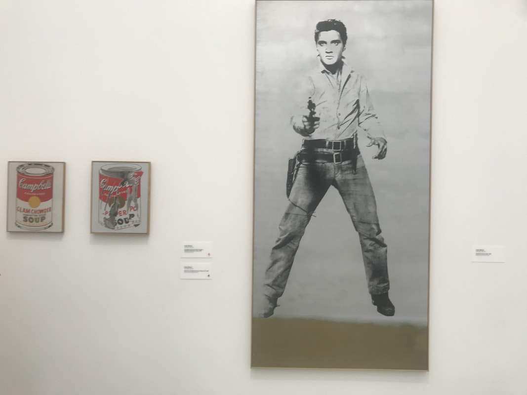
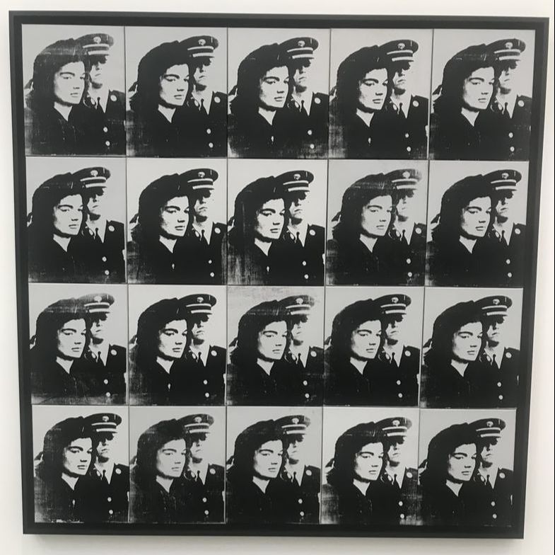
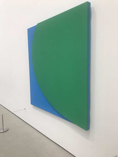
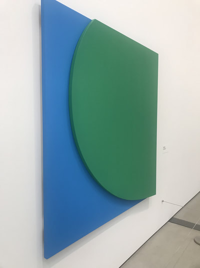
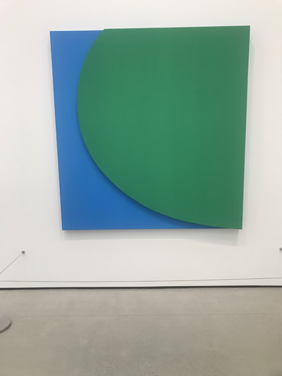
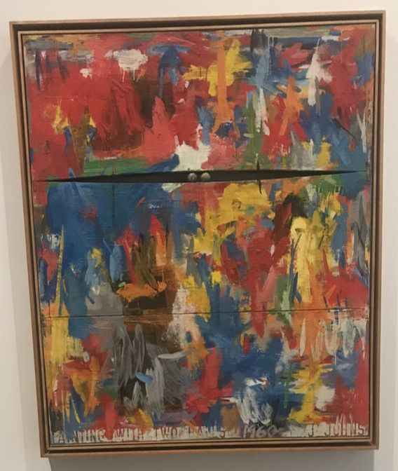
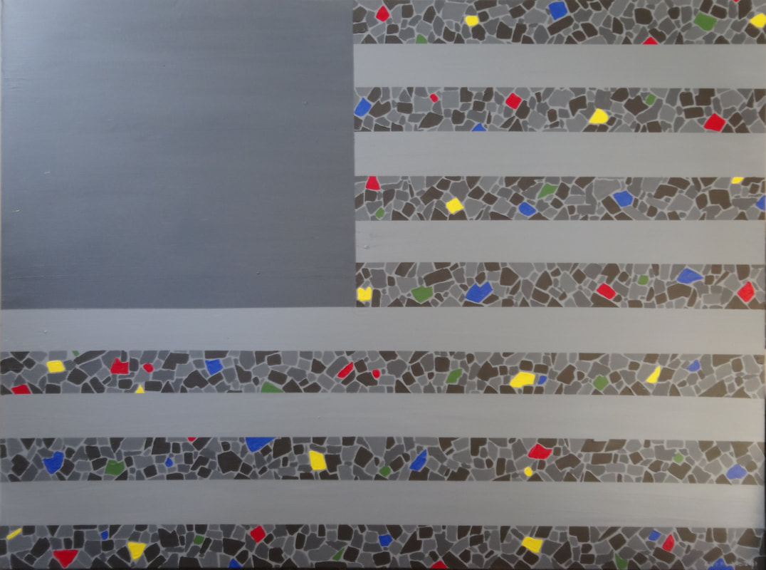
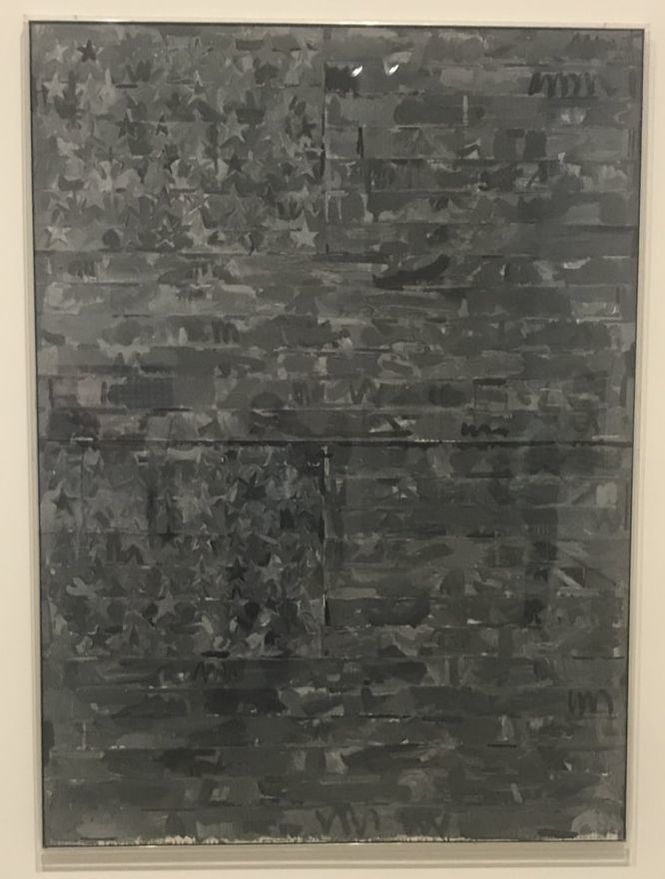
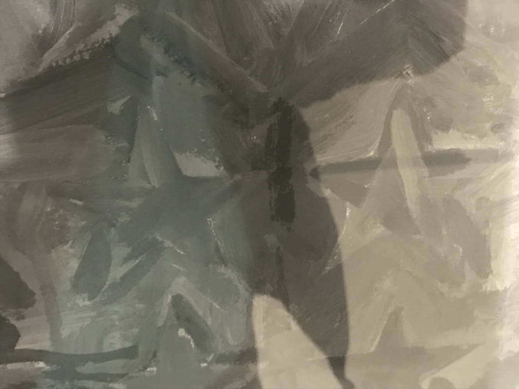
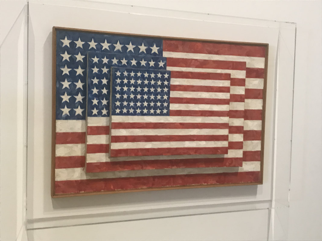
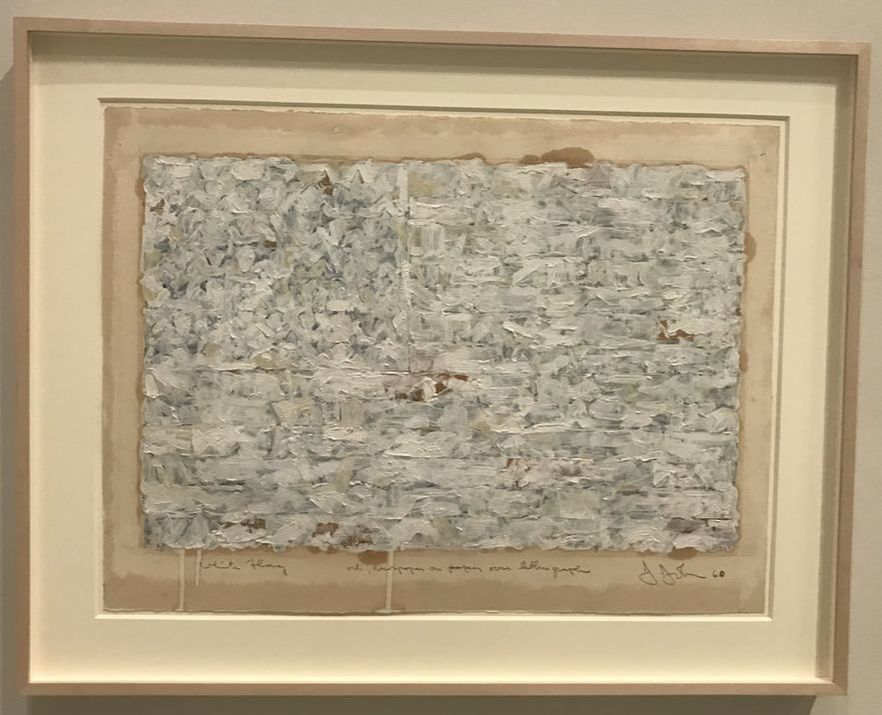
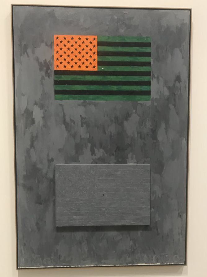
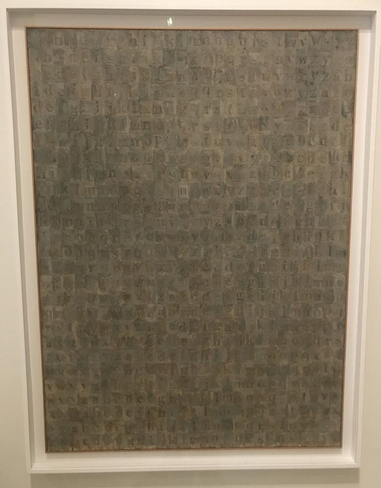
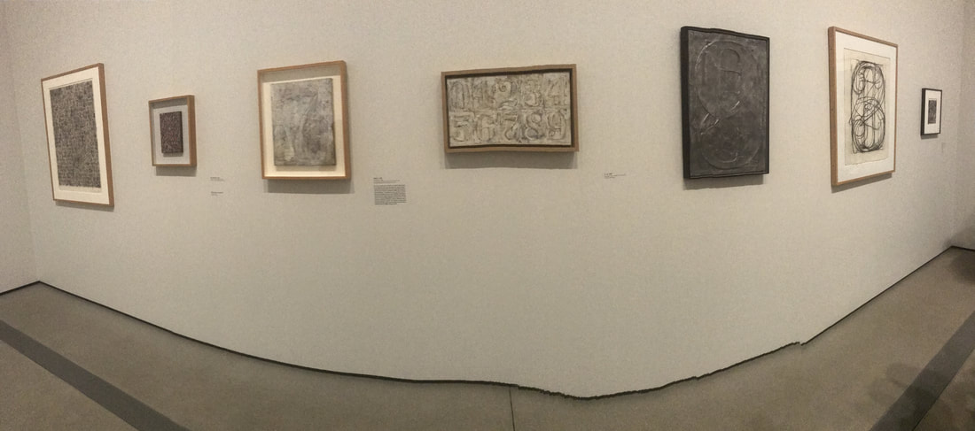
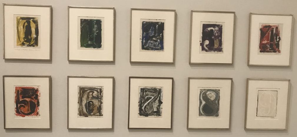
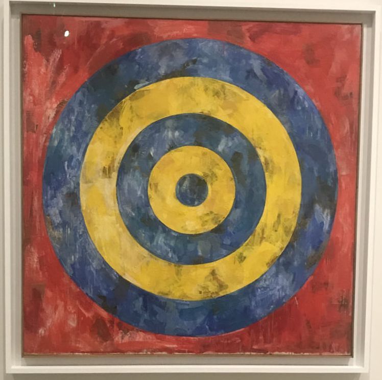
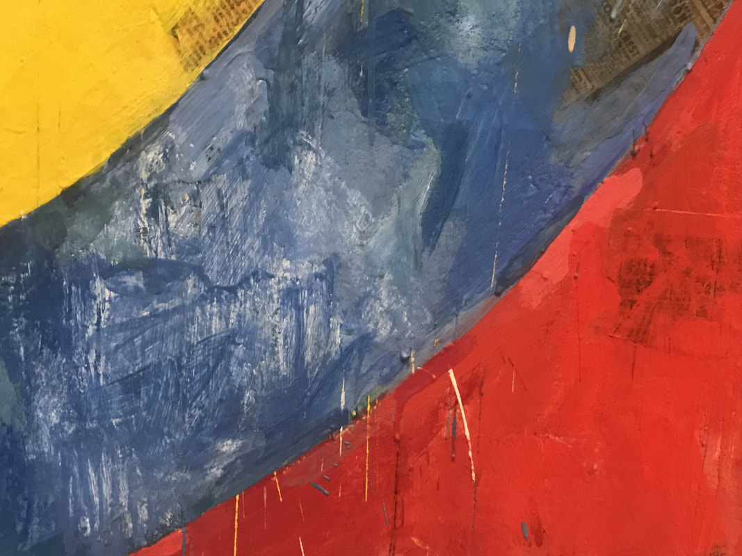
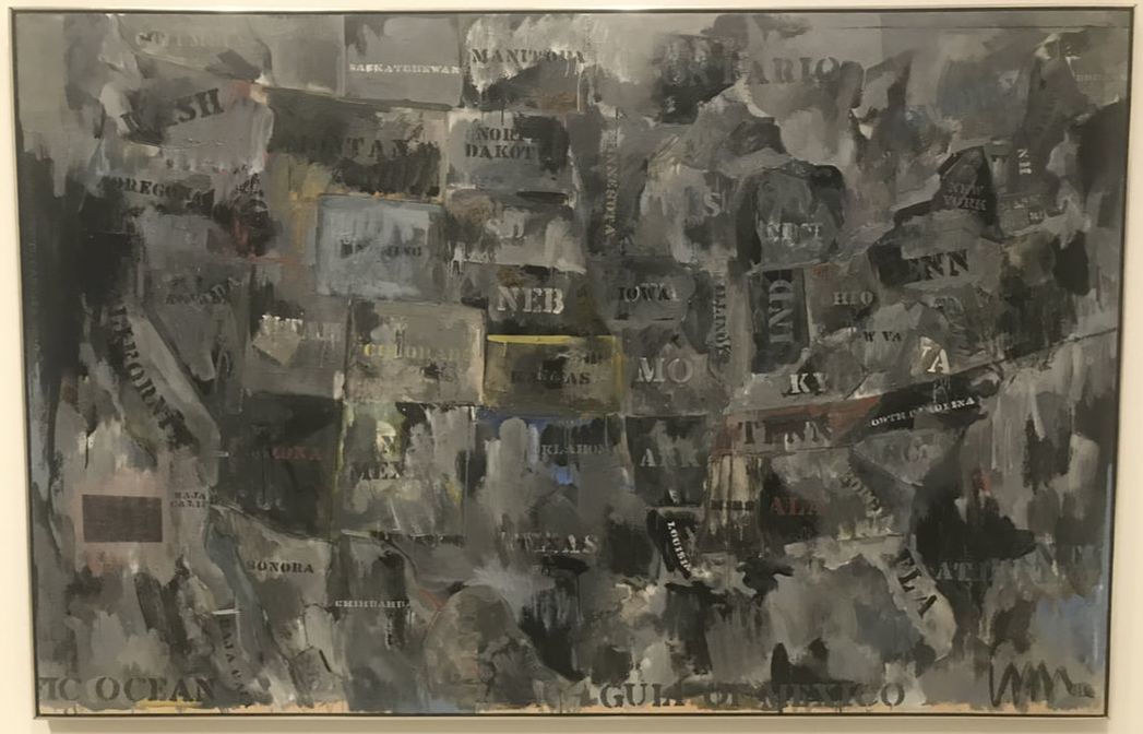
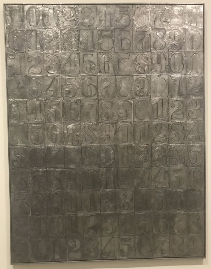
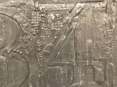
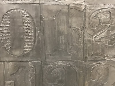
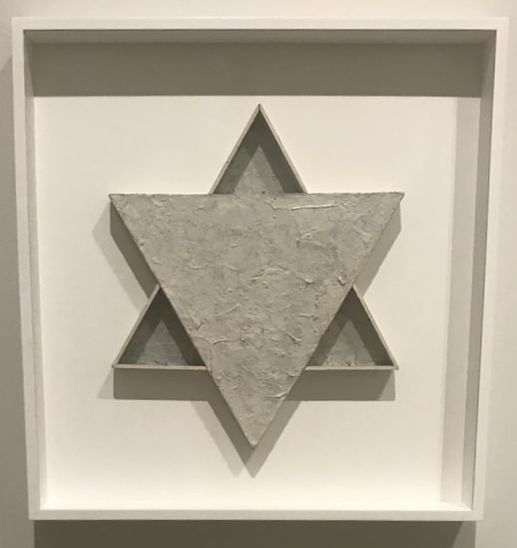
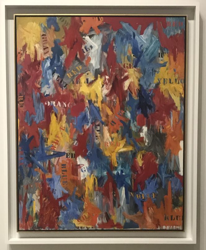
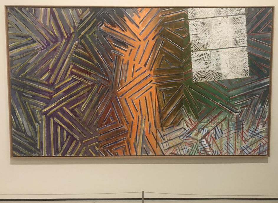
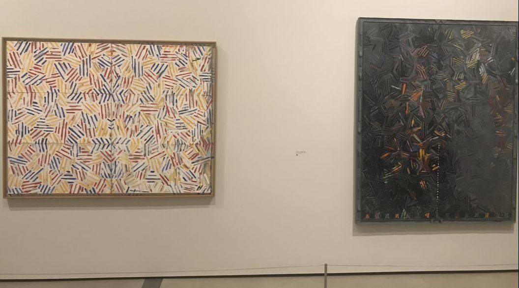
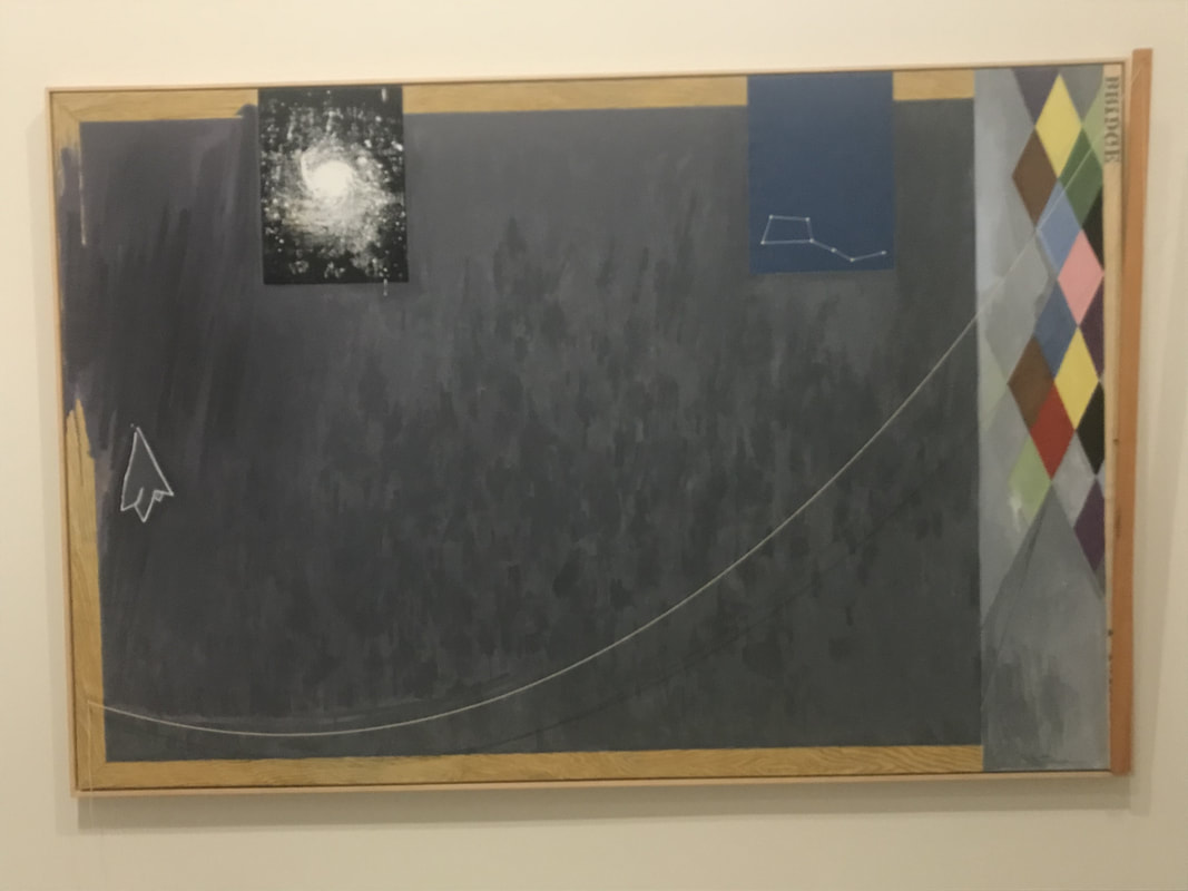
Roy Lichtenstein is one of my all-time favorite pop artists. He was one of the founders of Pop Art in the 1960s and used tiny dots in his artwork, similar to the printing style of comic-books. The dots were placed in such a way to create an image, imitating the way comic-books and newspapers were printed. In addition to borrowing or seeking inspiration from newspaper ads, commercials, and comic books, Roy Lichtenstein also was inspired by some of his favorite artists like Picasso and Mondrian. See the two images below. Here is a sculpture by Roy Lichtenstein, "Goldfish Bowl" created in 1977. It is painted and patinated bronze. On the right is a detailed view, showing that the sculpture is very two-dimensional, despite it looking 3-D. I always love seeing paintings by Chuck Close. Chuck Close is known for his detailed paintings of faces, and later he was known for the deconstruction of that detailed portraiture. He explores portraiture and created this photo-realist painting called "John", painted in 1971-72. I included a detailed shot showing the incredible painting technique. John Baldessari, "Tips for Artists Who Want to Sell" 1966-68, Acrylic on Canvas. John Baldessari never touched this painting, didn't paint it, didn't write the text. Here, it's the role of the artist as the facilitator of the artwork; creating the concept. The humor is that the view is shown the paintings message, but the message is text taken from an art magazine with tips on what art should be. Another one of my all-time favorite artists is Andy Warhol. A short time after Marilyn Monroe died in 1962, Andy Warhol started to create silkscreen images of Marilyn. I learned that Warhol had recently just learned how to silkscreen, so this was a somewhat new process for him! In the painting above, titled, "Two Marilyns" created in 1962, Warhol captures the terrible fact of Marilyn's death, as if he was reporting the news. With silkscreens, the images deteriorate with each printing, which I believe is symbolic of her presence and then her fading into history with her death. It can also be interpreted as the volatility of fame and celebrity. I'm not sure how many versions of "Two Marilyns" were created, but I learned that the one pictured above from The Broad Museum was the 27th version of the silkscreen created. Ellsworth Kelly worked with shapes and solid colors. The painting below, "Green Blue Red" created in 1963, uses colors and shapes to create contrast and bring attention to edges. In the above image on the left, the green rectangle and blue oval are vibrantly displayed against the red background. His composition almost goes against the principal of design of balance. Below, Kelly's oil on canvas painting, "Green Relief with Blue" was completed in 2011. It's actually two conjoined canvases and I've posted the photo of the same painting as seen from different angles. It almost acts like a 2 dimensional painting trying to be a sculpture, with different views from different angles. Jasper Johns: "Something Resembling Truth" A Special Exhibition at The Broad (Through May 13, 2018) While The Broad Museum's main collection has free admission, this special exhibition required a special ticket with a timed entry. The exhibit was one of the best I've ever seen. The exhibit covered over 6 decades of artistic achievement from this iconic American artist. The comprehensive exhibit features more than 120 extraordinary paintings, drawings, prints, and sculptures, by Jasper Johns and draws upon works from within The Broad's permanent collection as well as from loans from over 50 international public and private sources. The imagery he used in his artwork were common items such as American flags, numbers, letters, targets, and light bulbs. Perhaps Johns’ most famous painting, "Flag (1954–55)" and is a fairly accurate representation of the American flag, in encaustic on collaged paper and fabric.
The American Flad is a geometric composition that has a strong sentimental and patriotic value in society. Jasper Johns' flags ofent trick the eye, or blur the lines between perception, reality, and illusion.
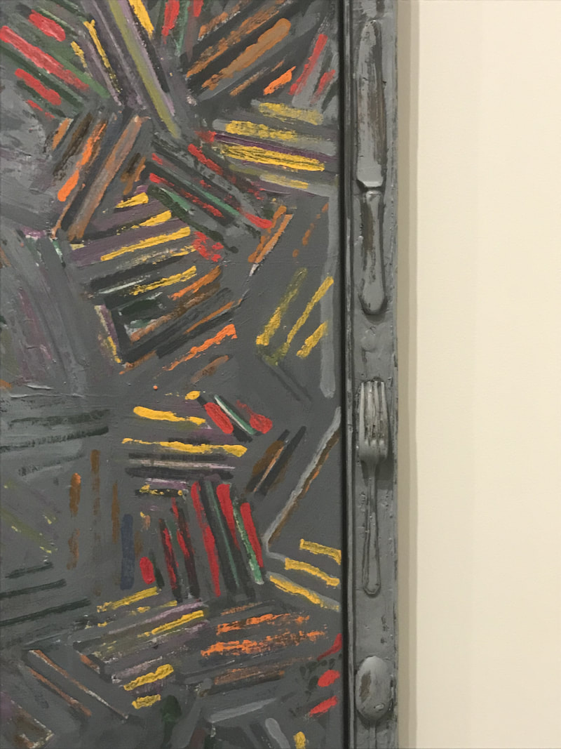
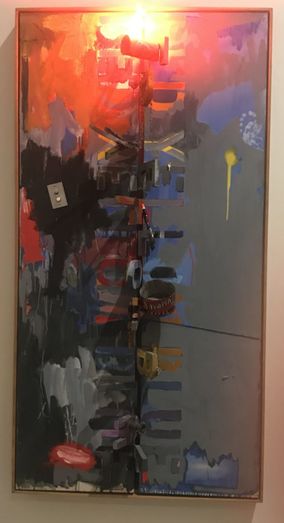
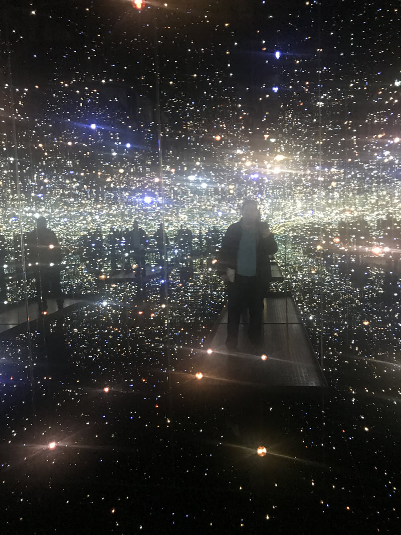
Jasper Johns began to incorporate objects and tools used in his artwork directly into the artwork's creation. Things like paintbrushes, color charts, and rulers. In the painting below, the "R" of "Red" is a neon light and wooden letters protrude outward from the canvas. I highly recommend you to experience the Jasper John Exhibit if you can! Also on the first floor was a very unique art installation by artist, Yayoi Kusama, titled "Infinity Mirrored Room--The Souls of Millions of Light Years Away." It is a mirror-lined room that includes LED lights that reflect endlessly in the mirrored space. It doesn't sound like much, but it is quite amazing to see. You need a separate timed ticket, which is free, and only one person can enter the room at a time for a duration of 45 seconds. As you can see, the Broad Museum is quite an amazing experience. I highly recommend you visit The Broad in Los Angeles and experience the art scene in Downtown LA. For more information about The Broad, please visit their website: www.thebroad.org Check out some of my other posts about Los Angeles!
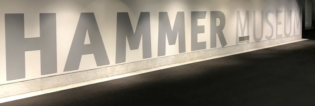
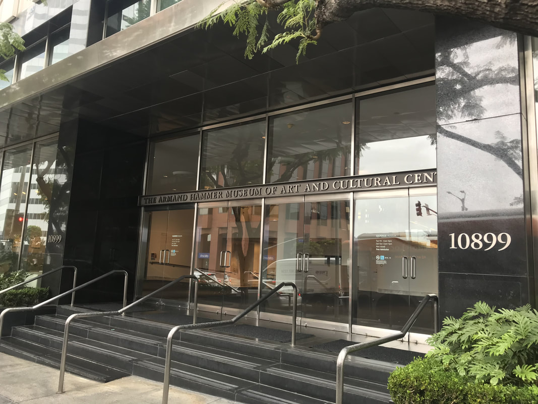
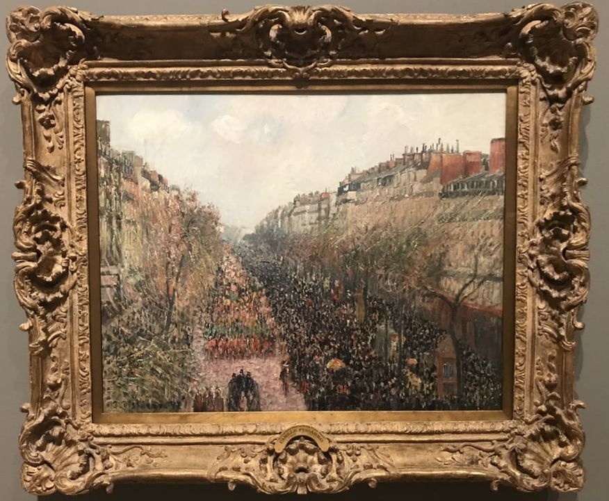
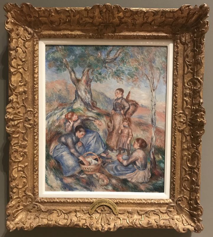
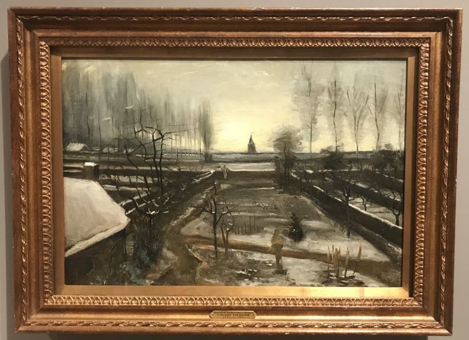
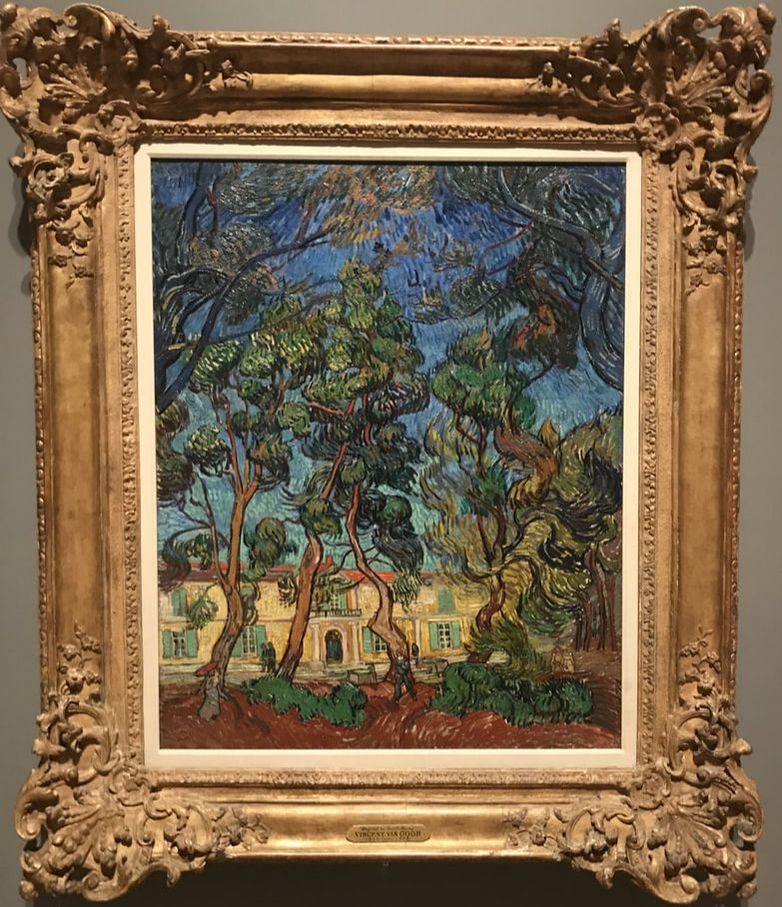
I love this painting below by Vincent Van Gogh, not because I love the imagery, but because it really doesn't look like a typical painting by Vincent Van Gogh! This painting, "Garden of the Rectory at Nuenen" was painted in 1885 in the Netherlands. The browns and grays are vastly different from the vivid, bright colors we are used to seeing in his later paintings when he lived in the south of France. Below is one of Van Gogh's more typical painting style with all the beautiful colors and brushwork. The painting, "Hospital at Saint-Remy" is oil on canvas and was painted in 1889. It depicts the scenery at the institution in the south of France where Van Gogh was being treated for severe mental illness. The Hammer Museum also has other galleries dedicated to contemporary artists. There was a really cool exhibit by the artist, Molly Lowe and another exhibit by the artist, Lawrence Abu Hamdan. Abu Hamdan uses a series of overhead projectors that cast images that have been created with a visualization tool that architects use to map the leakages of sound throughout a structure. The visuals are accompanied by audio that helps transform the research on a Syrian torture prison. I enjoyed looking at the exhibit from a visual perspective, but after reading about the artwork's meaning, it really makes me question my thoughts on conceptual art. Below is a photo of the small room that housed the projectors. Perhaps the most bizarre (in a good way) exhibit was called "Stories of Almost Everyone" featured in the large exhibit hall . It's a group exhibition of 40 artists that is about society's willingness to believe the stories that are conveyed by works of contemporary art. It really hones in on conceptual art and how we look at material objects. Below is a photo of the exhibit hall showing some of the artworks. I'm including a YouTube video that was created by the Hammer Museum with Will Ferrell and Joel McHale, which is very funny and addresses the issues related to conceptual art head-on. Art can be confusing and the fact that the Hammer Museum pokes fun at this, I think, is really bold. "Stories of Almost Everyone" runs through May 6, 2018. For more information about The Hammer Museum, check out their website: https://hammer.ucla.edu/. |
The Art ConnectionWelcome to Eddie Bruckner's Art Blog! Archives
April 2022
Categories
All
|
